For Assignment #1, I chose two photographs to crop: a landscape and a cityscape.
Original Photograph
Cropped just the tree...
Here I cropped out the bottom of the picture....
I did a quick mock-up to show what this image might be used for.
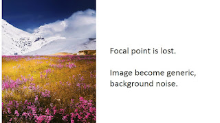
Here I cropped out the tree and the left side of the picture.
Another mock-up to show what the generic scenery may be used for.
This is the original cityscape photograph.
Here I cropped out all greenery.
I created a mock-up using the gray/lifeless photograph, then...
Using a different section of the same photograph and slightly altering the color saturation, I create a much friendlier looking picture of city life.
For this selection, I cropped out the center section of the road.
And created a mock-up using this picture.
Last picture - I cropped just the window.
PART 2
This was without a doubt the most enjoyable project for me so far. I chose to design two book covers. The assignment asked me to create two book covers using the title, "Flirting with the Bully".
First - I went with a horror theme. I used a flirty, delicate font to juxtapose the harsh background and unsettling image. I positioned my fonts to act as a sort of frame for the image.
Here's the second cover (and I added a back cover!) For this cover, I was going for Fantasy/Dark Fairy Tale theme. I used two different woods pictures to highlight the image against the background. I tried to choose a whimsical font that wasn't too princess-y. Enjoy!


Erika, you did a great job with the cropping assignment. I love that you included your thought process within the images, so it shows not only what you were thinking, but how your cropped images would be used in an overarching design. The different in color saturation in the "why not visit Sunnyville" photo make such a huge difference in the perception of the image. I also like the visual line you created with the road, which then feed into the arrow, drawing the viewer's eye along a clear, easy trajectory. Nice work!
ReplyDeleteHi Erika,
ReplyDeleteI really like that you included advertising in your cropped photographs. It added the extra potential for their use, and provided different perspectives on the image. I like that you highlighted the street in the cityscape to create movement and direction. It makes you wonder what is beyond the edge of the frame. Your book covers were very intriguing...especially the period image of the girl in the woods with the nefarious shadowy character to the right. It opens up a different thought process on what might be considered a bully. Thank you for sharing!
Erika,
ReplyDeleteI agree with Shawn....loved how you incorporated mock up versions of how these cropped images could be used. You can tell that you really put in a lot of thought to the particular crops and how they could be utilized in print for other purposes than just another picture. Your ability to use the cropped images in forms of advertisements along with the other elements of design we have learned is demonstrating how much you have truly grasped from this course so far...great job with that activity.
Lauren
Hi Erika,
ReplyDeleteI think you did an amazing job with this week's Mini Art School. I loved how you cropped the landscape and showed how the new cropped image could be re-used. That was important because it shows that the image still has a purpose. I also really enjoyed your book covers. The theme is expressed consistently throughout both of them and is really quite interesting! I would definitely take a look at that book if I saw it on the shelf. Great job!
Hi Erica!
ReplyDeleteGreat post! I love your cropped photos exercise. Looking at all of the photos next to each other, you can see how important it is to remember to visualize the focal point. Where do you want your viewers to look first? This is an important concept to understand even for non-teachers. Your book covers look amazing! I love how you chose a very feminine font for the book title on top of a black and white photo. The photo selection was also well done as it did a good job of both capturing the audience and pushing the book's topic.
Erika*
DeleteSorry about that! Stupid autocorrect!